01 / 12
Amira Apparel
- Client
- Amirá
- Discipline
- Campaign, Content, Creative Direction
- Year
- 2022–23
- Services
- Campaign key visuals, Lookbook & catalogue design, Social media design, Festive & occasion content, Event promotion, Layout & art direction
01Overview
Seasonal campaigns, a 22-page winter lookbook and an always-on social system for Amirá — a Bangladeshi fashion house dressing women and men in contemporary ethnic wear.
The work spans the Rongila Vol. II winter lookbook and catalogue, launches for AMIRÁ MAN, fabric and product posts, event promotion, and artwork for the moments Bangladesh celebrates — 21 February, Sharodotsob and Valentine’s Day.
02Challenge
Winter in Bangladesh has a reputation for being muted. The collection set out to prove otherwise.
Rongila Vol. II started from the brand’s own belief that the cold season is the most colourful time of the year — weddings, long outdoor afternoons, cities you can finally walk. The design had to carry that optimism through a lookbook, launches, product posts and a calendar of cultural moments, without the brand splintering into a dozen different looks.
03Objective
Make every touchpoint feel like the same house — and make that house feel like colour.
One visual language that could stretch from a 22-page lookbook to a single Instagram square, and from a menswear launch to a Durga Puja greeting, while letting each garment’s print stay the hero.
04Thinking
Let the garment set the palette. Let the monogram hold everything together.
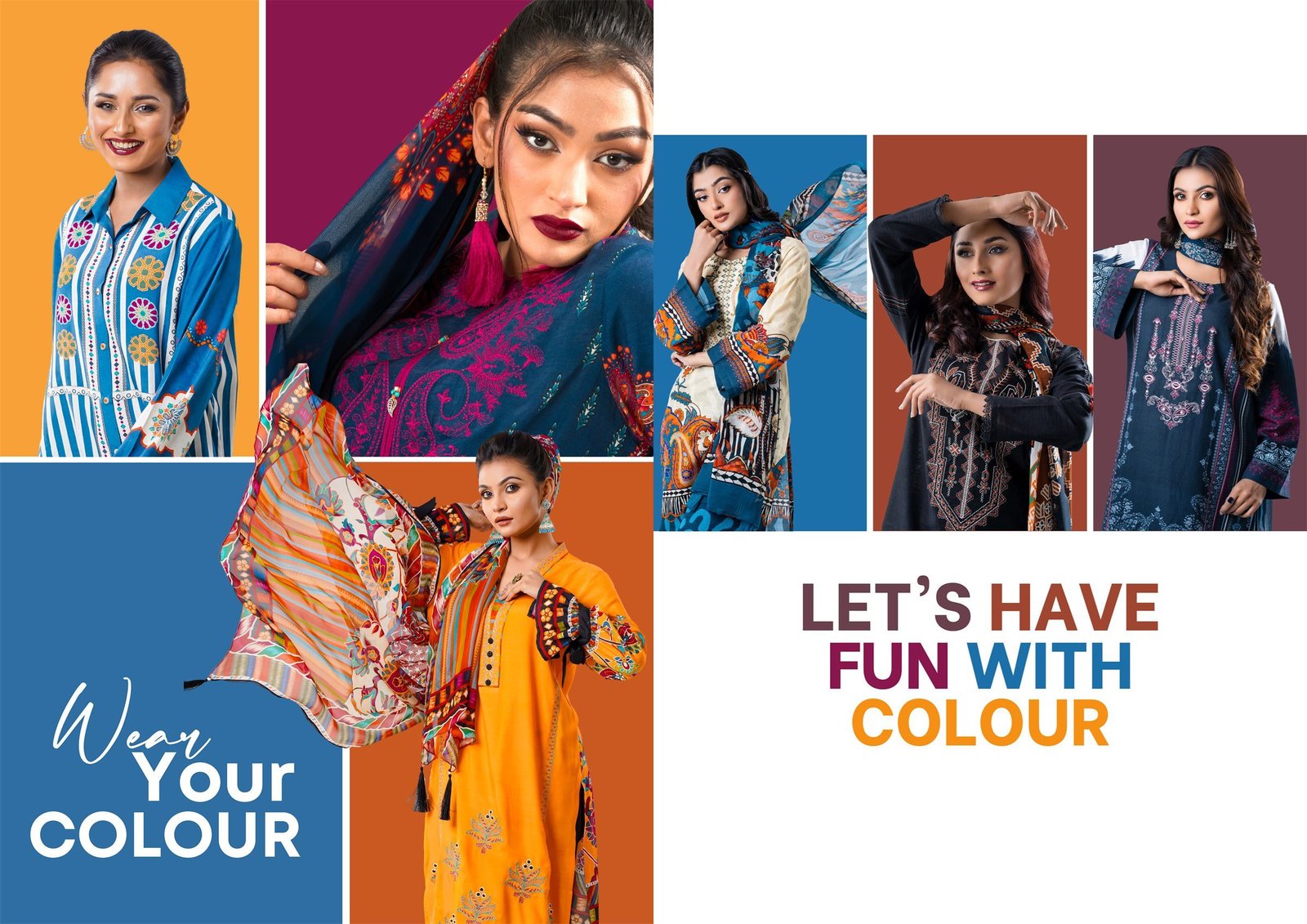
Instead of forcing one brand colour onto every layout, each composition pulls its colour field from the clothes themselves — mustard behind navy, oxblood behind black, teal behind yellow. What stays constant is structure: the Amirá arch monogram used as an architectural frame behind the models, and three voices of type — a high-contrast serif for collection names, a handwritten script for mood, a clean sans for the facts.
05Creative Direction
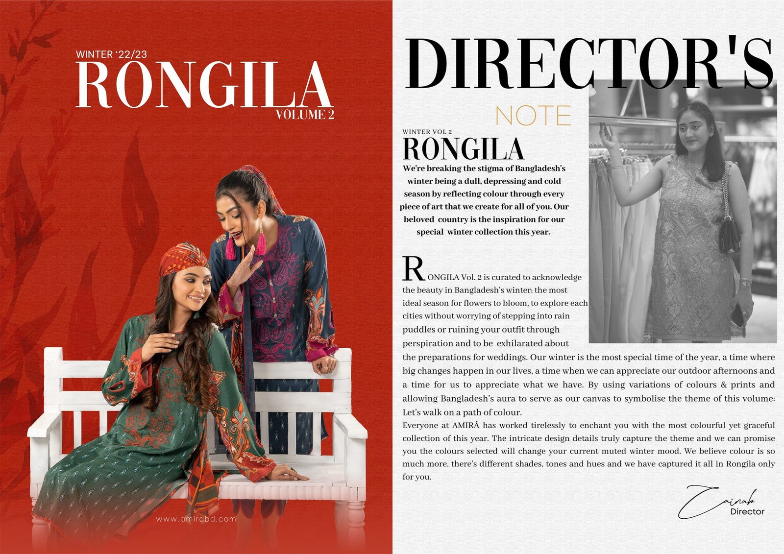
An editorial voice, not a catalogue grid.
The lookbook is paced like a magazine: a cover and a director’s note to open, then spreads that alternate hero portraits, cropped print details and collaged cut-outs. Every spread gets its own headline — Drishayan, Classic Statement, Blues, Black, Winter Glam — so the collection reads in chapters rather than product codes.
06Identity
A repeatable system for the everyday posts.
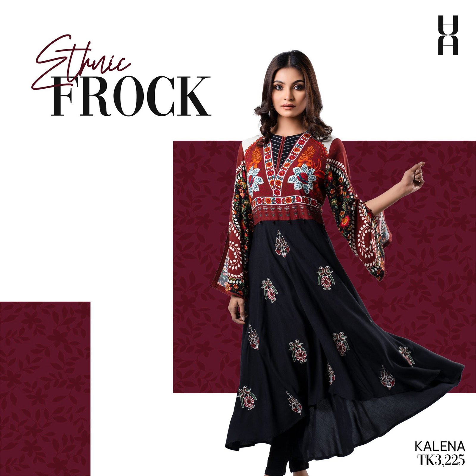
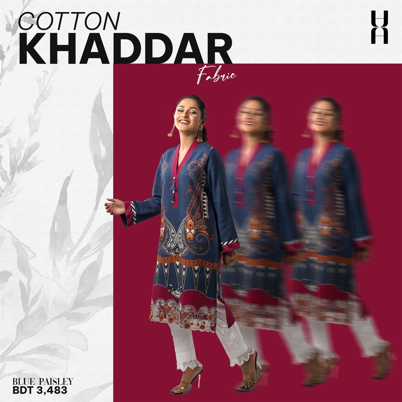
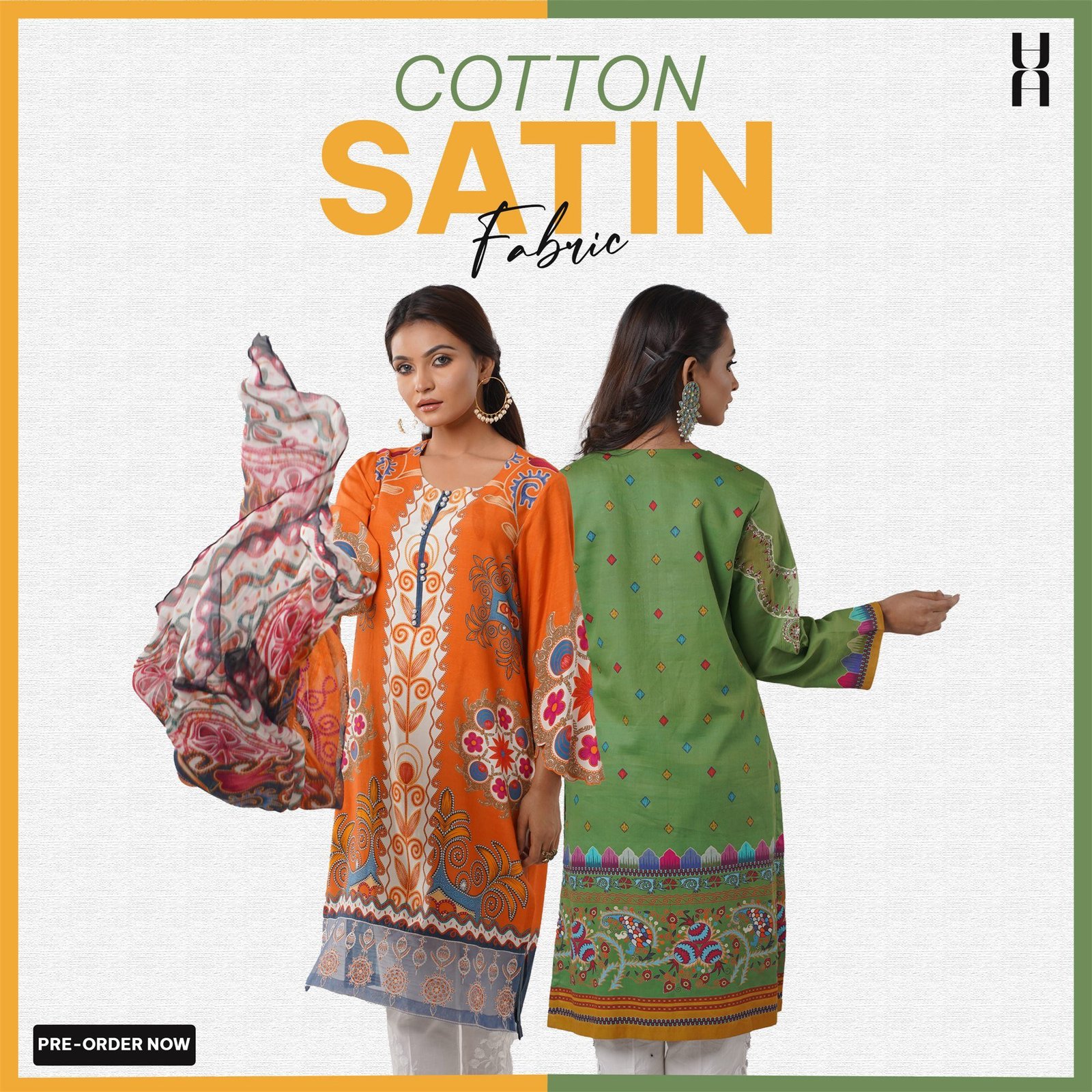
Product posts follow one template: a script-and-serif fabric title top left, the monogram top right, a colour block lifted from the print, and the product name and price set quietly in a corner. Movement is suggested in still images — echo trails on Cotton Khaddar, a skirt caught mid-turn on the Ethnic Frock.

07Campaign
Fearless & Bold — the same system, taken into menswear.
For the Winter ’22 AMIRÁ MAN launch, the monogram arch becomes a tall caramel pillar behind three tailored blazers. The flanking figures are set in black and white so the central check jacket carries the colour. Kabli Wear reuses the formula with hand-drawn architecture, keeping menswear unmistakably part of the same house.
08Execution
Built for every format and every date in the calendar.
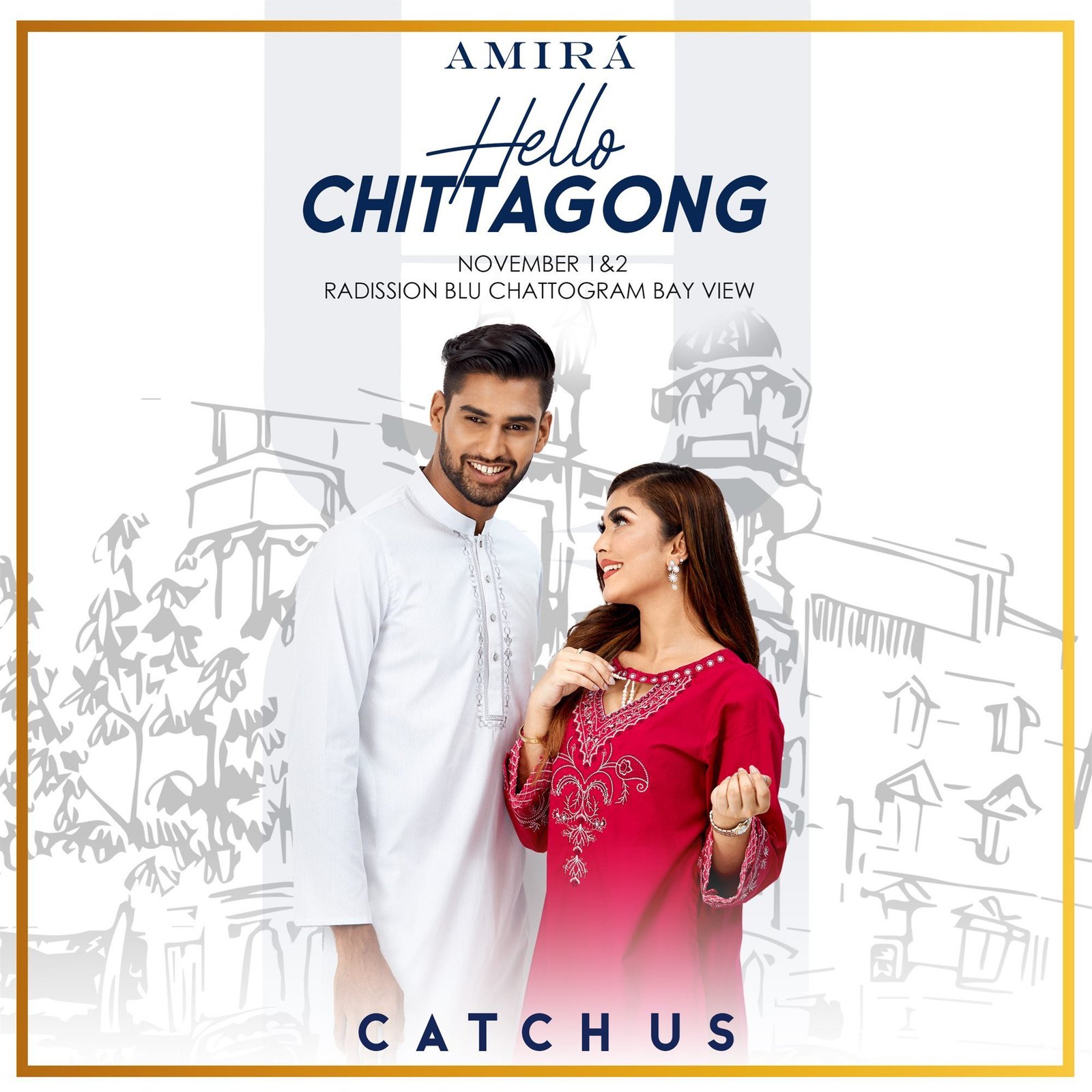
The system was produced across square feed posts, vertical stories, a printed catalogue and event promotion — including the Hello Chittagong pop-up at Radisson Blu Chattogram Bay View. Cultural dates got their own artwork: 21 February built the Shaheed Minar from the monogram, Sharodotsob framed the collection with line-drawn arms of Durga, and Valentine’s Day turned the AMIRÁ and AMIRÁ MAN shopping bags into a couple.
09Outcome
One house, many seasons — recognisable before the logo.
A lookbook spread, a fabric post and a festive greeting all read as Amirá at a glance: the arch, the colour fields, the three voices of type. A kit built to keep producing in, season after season.
10Gallery
11Reflection
Colour is easy to add. Making it feel intentional is the work.
The most useful decision was restraint in the structure — fixing the monogram, the type voices and the grid — so the prints could be as loud as they needed to be.